At Envission Publishing, we believe that every book tells two stories—one in words and one in design. The latter is often invisible, unspoken, and quietly powerful. It shapes how a book feels in the hands, how it moves through the eyes, and how it lingers in the mind.
We design with intention. That means every layout choice, every typeface, every margin, and every icon is chosen not because it looks good—but because it feels right for the reader. Beauty is not an afterthought; it’s at the heart of how we serve our audience.
In an age where publishing has become fast and formulaic, we’ve chosen a slower, more mindful path—one that honours the reader’s experience as much as the author’s voice.
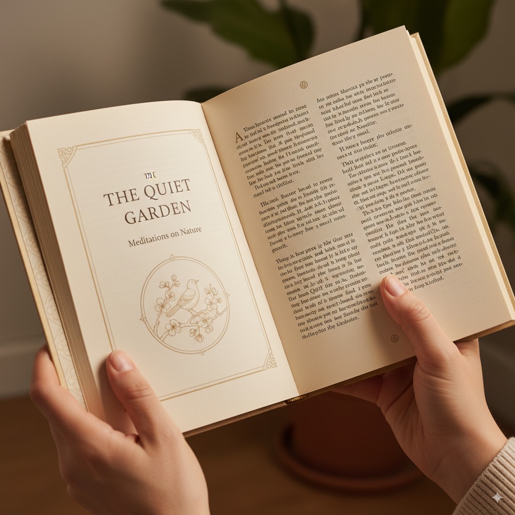
Composition: A Quiet Guide for the Eyes
The structure of a page is more than just placement—it’s choreography. White space, line length, paragraph breaks, and flow determine how a reader moves through the page. When done well, the composition becomes invisible—it supports, not distracts. It guides, not dominates.
For a puzzle book, this means a layout where clues are accessible, the grid is balanced, and the eyes aren’t fatigued. For a colouring book, it means ensuring each page is spacious, clean, and inviting—especially for little hands that might still be learning to colour within lines.
We never cram content for the sake of quantity. We respect the page as a space for thought to breathe.
Typography: The Personality of the Page
Type is the voice of the page. And just as tone matters in speech, typography matters in design.
We don’t just “use fonts”. We select typefaces that reflect the mood and purpose of each book. A word search puzzle might feature rounded, friendly sans-serif fonts that are easy for children to read. A book of gentle reflections may use a serif font that evokes calm and quiet sophistication.
But it’s not just about aesthetics. Typography affects readability—line spacing, font size, weight, and alignment can make the difference between ease and frustration. We carefully test for legibility across devices and print, especially keeping in mind children, early readers, and even elders who may access our books.
Typography is where beauty meets clarity. We aim for both.
Icons and Visual Elements: Small Details, Big Impact
Every visual element in our books—be it an icon, border, or illustration—is chosen with purpose. We never use clip art as filler. Every star, arrow, or symbol must serve a function: to clarify, to guide, or to gently delight.
In our colouring books, illustrations are created with thick, bold outlines suitable for young children. No distracting greyscale or confusing textures. In our puzzle books, symbols are simple, culturally sensitive, and universally understandable. Where needed, we create custom icon sets to maintain visual consistency and tone.
Good iconography is like punctuation in design—it supports flow and meaning without shouting.
The Reader is Our North Star
The thread that runs through every design decision is a question we constantly ask ourselves: What would be best for the reader?
Would this layout overwhelm or invite?
Would this font distract or comfort?
Would this icon confuse or clarify?
Would this page design encourage the reader to turn to the next?
We never design for trend; we design for experience. Because ultimately, our books are not about us. They are about the people who hold them, flip through them, colour in them, puzzle over them, or gift them.
We want our books to be felt, not just read.
Design as a Form of Respect
To us, design is a way of showing respect—respect for the reader’s time, attention, and aesthetic sensibility.
We believe children deserve beautifully designed books, not just “functional” ones. We believe a puzzle book can be elegant. We believe simplicity is not the absence of effort, but the result of thoughtful choices.
In a world of visual noise, a well-designed book is an act of calm.
A Signature You Can Recognize
Over time, we hope our readers come to recognise the subtle signature of Envission Publishing: clean layouts, careful typography, elegant structure, and a certain quiet confidence. Books that aren’t loud but quietly arresting. Books that don’t just inform or entertain—but elevate the everyday experience of reading and interacting.
Because a book isn’t just a container for content.
It’s an experience in itself.
And every experience, we believe, deserves to be beautiful.